Case study · Logo & lettering

Ayaku Cacao

A mark for an Ecuadorian cacao brand: a vessel of mysterious liquid, drawn from the Chakana cross and the Andean spiral.

Client
Ayaku Cacao
Role
Logo concept & lettering
Year
2026
Scope
Logo lockup
01 — The brief

Two shapes and a feeling.

Ayaku came to me with two shapes and a feeling. The shapes were the stepped Chakana cross and the spiral, carved into Andean stonework for centuries. The feeling was a vessel holding something magical. The job was to merge them into one idea.
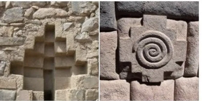
Reference photos: a stepped Chakana niche in a stone wall, and a carved spiral within a Chakana cross
Reference imagery: Chakana stonework and a carved Andean spiral. Photos: unknown, sent by the client.
02 — First sketches

Everything the shapes allowed.

I drew everything the two shapes would let me: spirals on steps, steps inside bowls, letterforms borrowed from both.
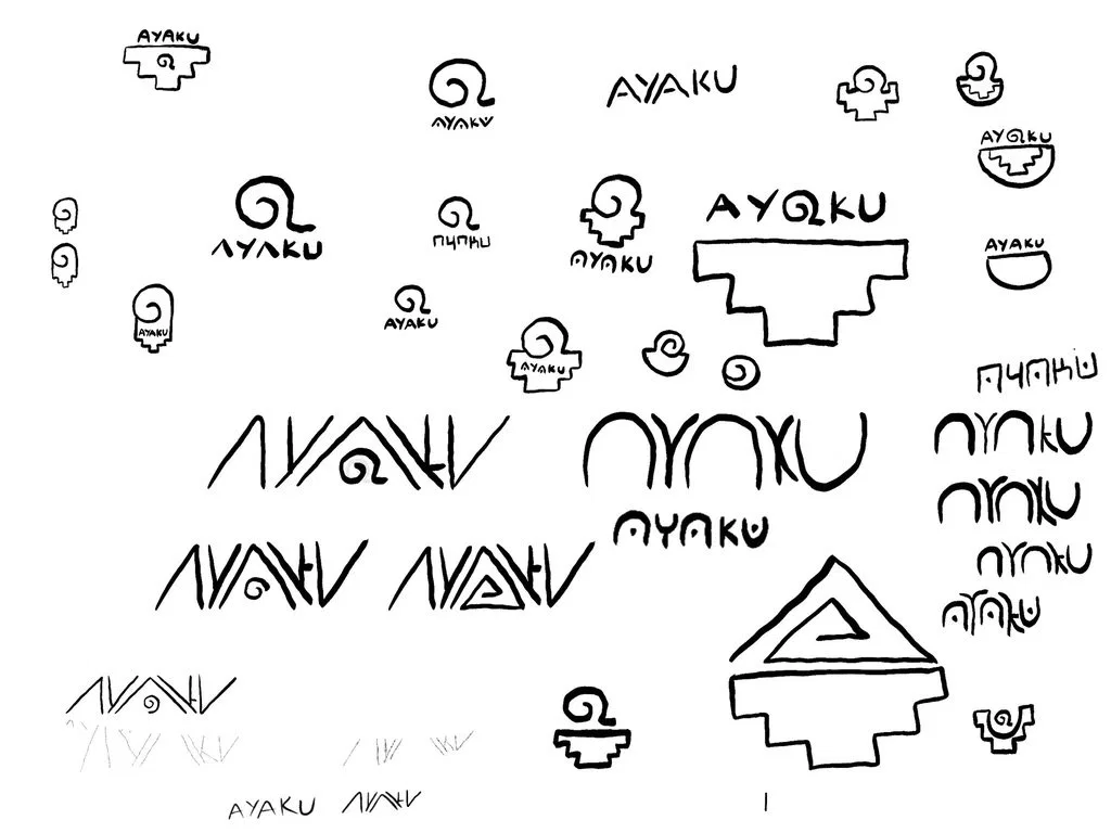
Page of ink sketches exploring spirals, stepped forms, bowls and AYAKU letterforms
The first page: every combination of spiral, step and letter.
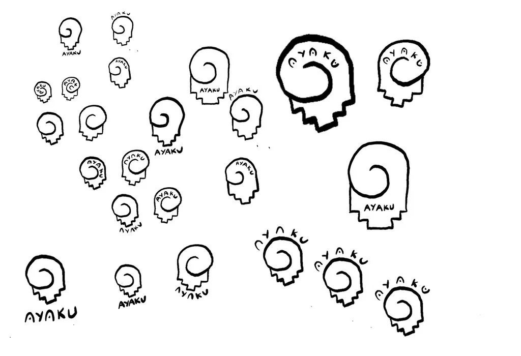
Many small variations of a spiral sitting on stepped shoulders with the name placed around it
Narrowing down: one idea, many placements for the name.
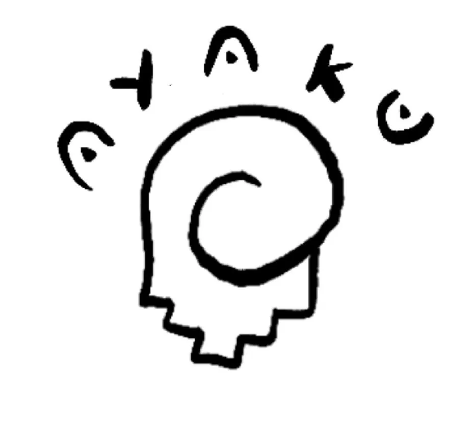
The chosen sketch: a spiral on stepped shoulders with the name arching above
The one I kept coming back to.

One combination kept pulling me back, a soft curl resting on the Chakana’s steps. It looked like a twist of chocolate. It looked like “yum”.

03 — Route one: the curl

Too soft. Too sweet.

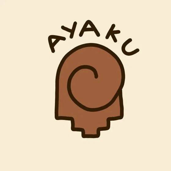
I took it digital and tested it in colour. The more finished it got, the clearer the problem became. It was too soft, and it looked like a children’s ice cream brand.
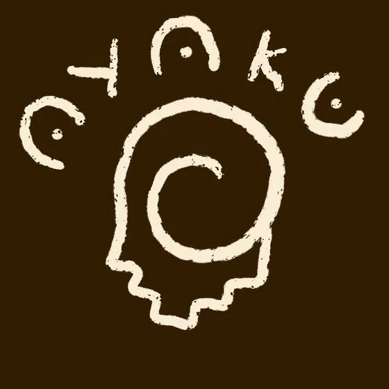
Curl concept as cream line work on dark brown
Cleaned up.
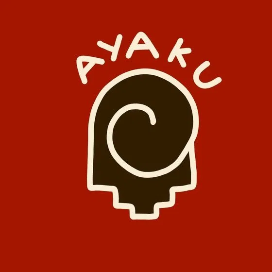
Curl concept filled brown on a red background
Tested in colour.
Curl concept in copper on cream with a rounded wordmark
Delicious, but for the wrong reasons.
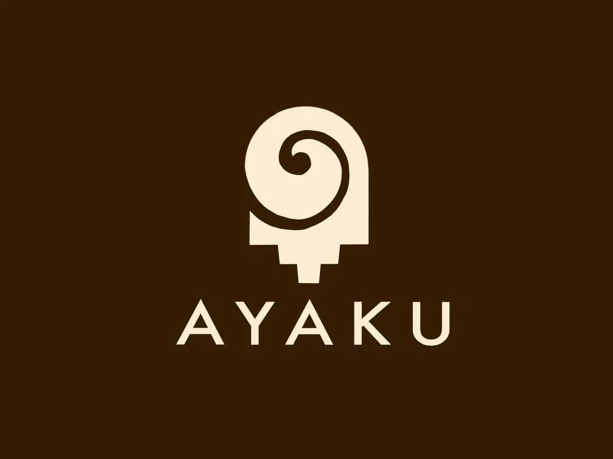
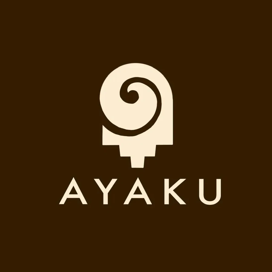
Solid cream mark on dark brown, with a negative-space spiral on a narrowing stepped stem and wide-set sans AYAKU beneath
Solid form, negative-space spiral, wide-set sans.
04 — Growing it up

Richer, but still an ice lolly.

So I made it heavier: a solid form, the spiral cut in as negative space, a quiet, wide-set sans for the name. It felt richer and more premium. But the silhouette hadn’t changed. A rounded top on a narrowing stem is still an ice lolly.

05 — Back to the brief

It asked for a vessel.

The brief never asked for a treat. It asked for a vessel. I went back to a bowl shape from my very first page and started again from there.
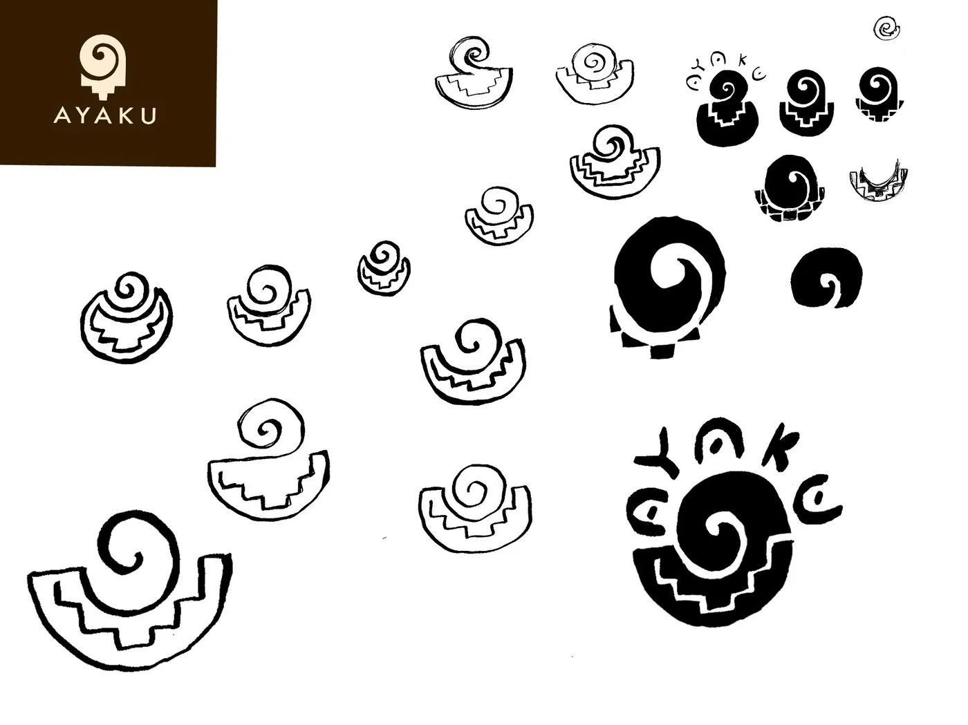
Sketch page of bowls with stepped patterns and spirals rising from them, with the earlier route shown in the corner
Round two: the spiral moves into the bowl, the steps become its decoration.
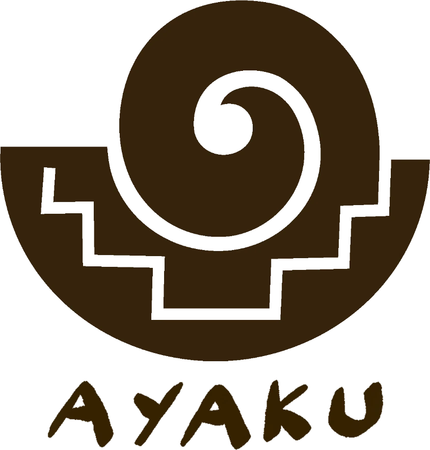
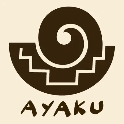
Final Ayaku lockup: a bowl carved with a stepped Chakana pattern, a spiral rising from it, and hand-lettered AYAKU beneath
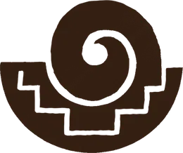
The final mark: a dark bowl with a cream stepped Chakana line carved into it and a spiral rising from its centre
06 — The mark

A bowl of cacao.

Every shape the brief asked for now has a job.

  1. 1The steam. The spiral rises out of the bowl like the scent of something warm and mysterious.
  2. 2The carving. The Chakana’s steps are cut into the bowl’s side, like decoration on Andean pottery.
  3. 3The vessel. A bowl of rich, dark cacao.

Once it was finished, I noticed it looked like a pintadera, one of the clay stamps used in pre-Columbian Ecuador to press designs onto the body. The resemblance was an accident, but it felt right, so I named the mark the Pintadera.

07 — Details

The name found its weight.

The name had its own journey: bouncy, then geometric, then hand-lettered, with the same carved, handmade weight as the mark.
Rounded wordmark version
Rounded
Geometric sans wordmark version: the solid mark and wide-set AYAKU in cream on dark brown
Geometric
Final hand-lettered wordmark version
Hand-lettered
160 px
64 px
32 px
16 px
Scale test, from packaging down to favicon.
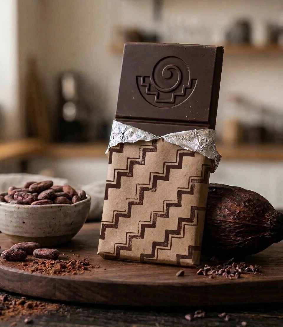
Concept mockup: a dark chocolate bar embossed with the Ayaku mark, half-wrapped in kraft paper with a stepped pattern, beside cacao beans and a podConcept mockup
08 — In use

A stamp, after all.

Pressed into the bar, the Pintadera does what its namesake did. The carved steps and spiral hold their shape in relief, which is fitting for a shape borrowed from stone.

09 — Outcome

Where it went next.

Ayaku took the concept forward and developed their own version of the mark in-house, keeping the bowl, the steps and the rising spiral.
Torren Pietzsch
Hi! I’m Torren Pietzsch, a London-based designer and creative producer. Below are some of my creations, feel free to look around!
all 16 projects
2024▶ preview

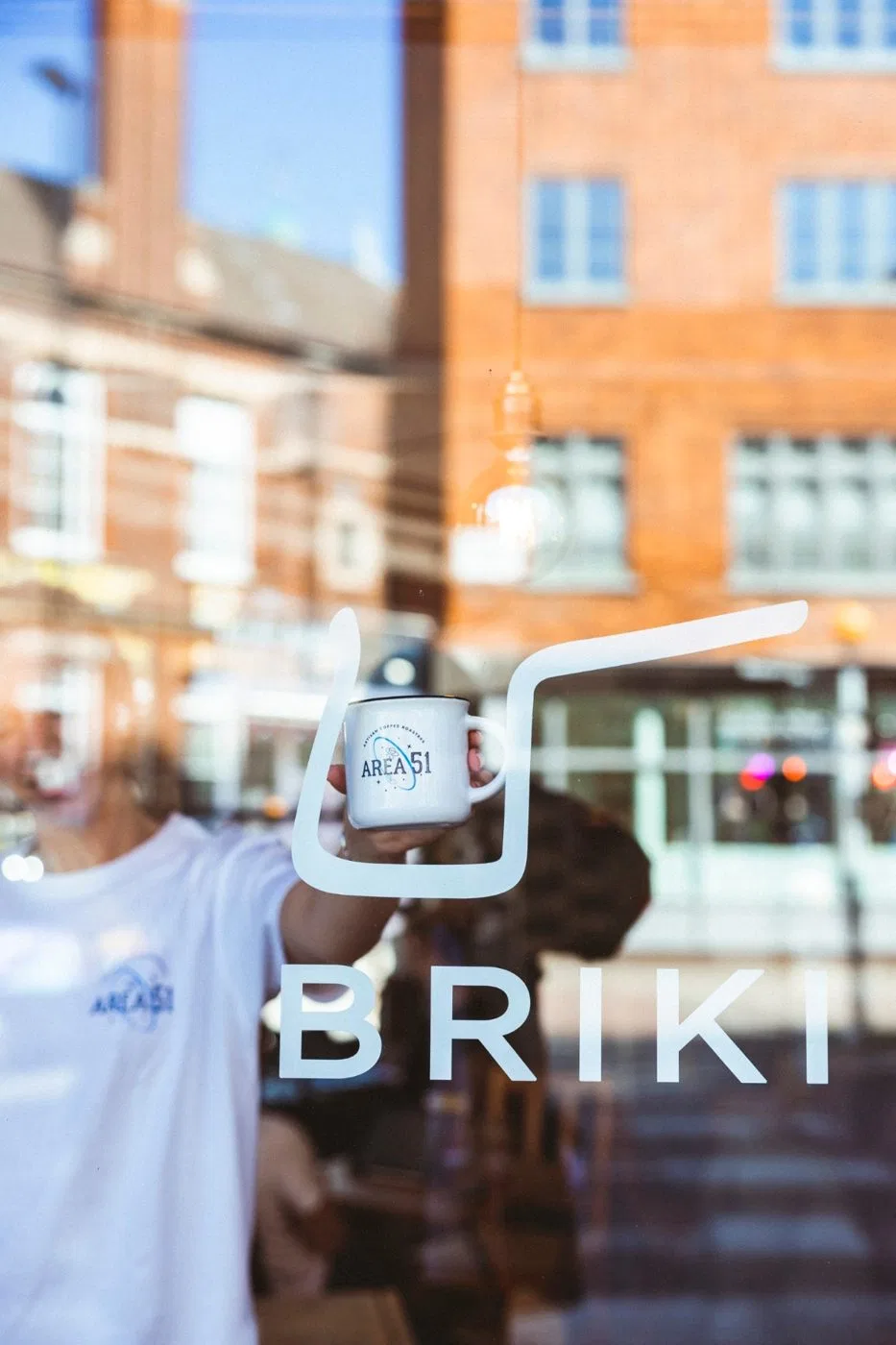
Briki

CASE STUDY →

Refreshed a much-loved Exmouth Market café’s brand and built a site 7,000 people used in year one.

  • Client
  • Brand
  • Digital
2026▶ preview

Ayaku Cacao

CASE STUDY →

A bowl of cacao, built from two ancient Andean symbols.

  • Client
  • Brand
…and build it in painted letters
Ongoing▶ preview

Painted Names

CASE STUDY →

Type a name. Build a painting. A personalised print shop where every letter is an original artwork.

  • Playground
  • Brand
  • Digital
2019–2020▶ preview

Proactive

CASE STUDY →

Took a new brand from logo to launch: website, a launch party for 100 and a year on the expo circuit.

  • Client
  • Brand
  • Digital
2023▶ preview

Golden City

VIDEO →

A journey up through the Golden City to meet its Godking.

  • Playground
2025▶ preview

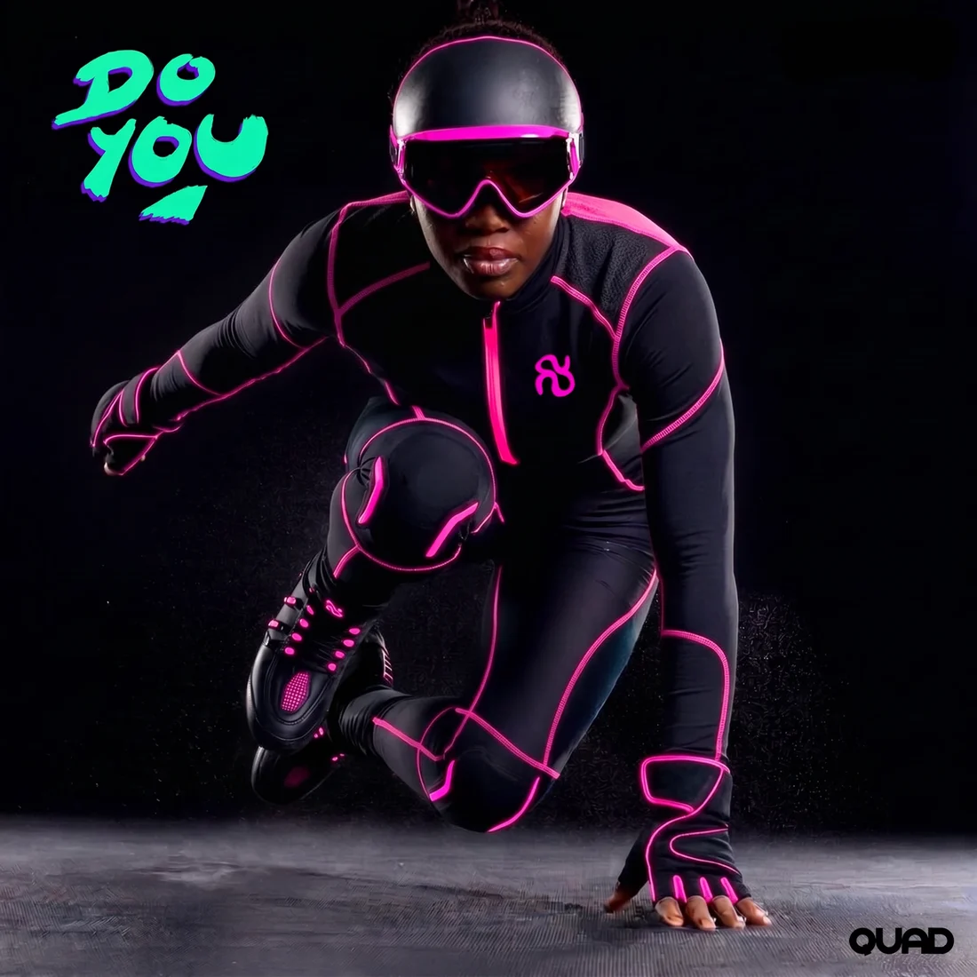
QUAD

CASE STUDY →

A brand for a sport that doesn’t exist yet.

  • Playground
  • Writing
  • Brand
2025▶ preview

Spookopolis Strikes Back

GALLERY →

A chalk mural at the Old Diorama Arts Centre.

  • Playground
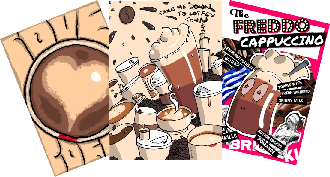
Gift Card Art
2024▶ preview

Gift Card Art

GALLERY →

My illustrations for Briki’s Pay It Forward gift cards.

  • Client
  • Playground
  • Brand
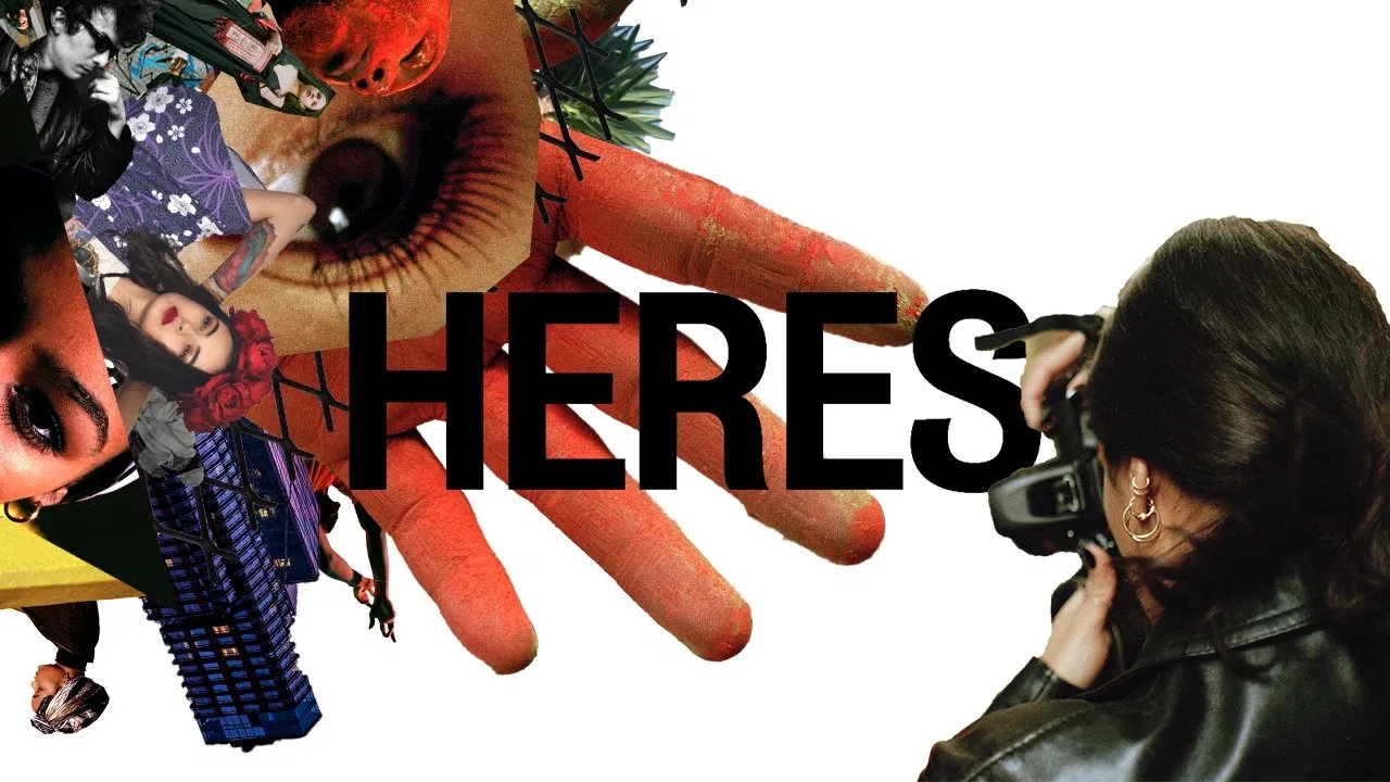
2019▶ preview

HERES

VIDEO →

Animated promo bumps for a London photography, art and events collective.

  • Client
  • Playground
  • Brand
  • Digital
2025▶ preview

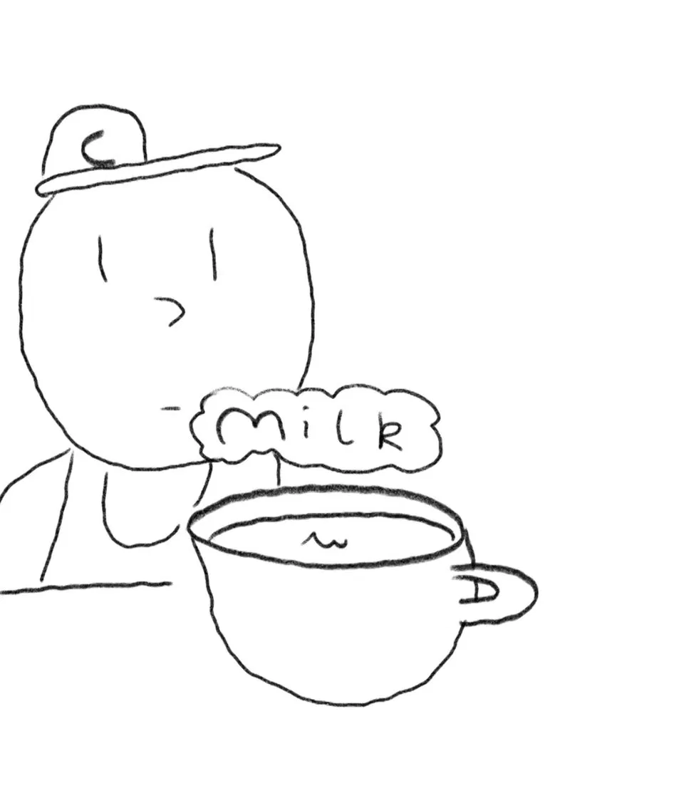
Milk

VIDEO →

An animated conversation between me and my best friend Meredith.

  • Playground
  • Digital
2025▶ preview

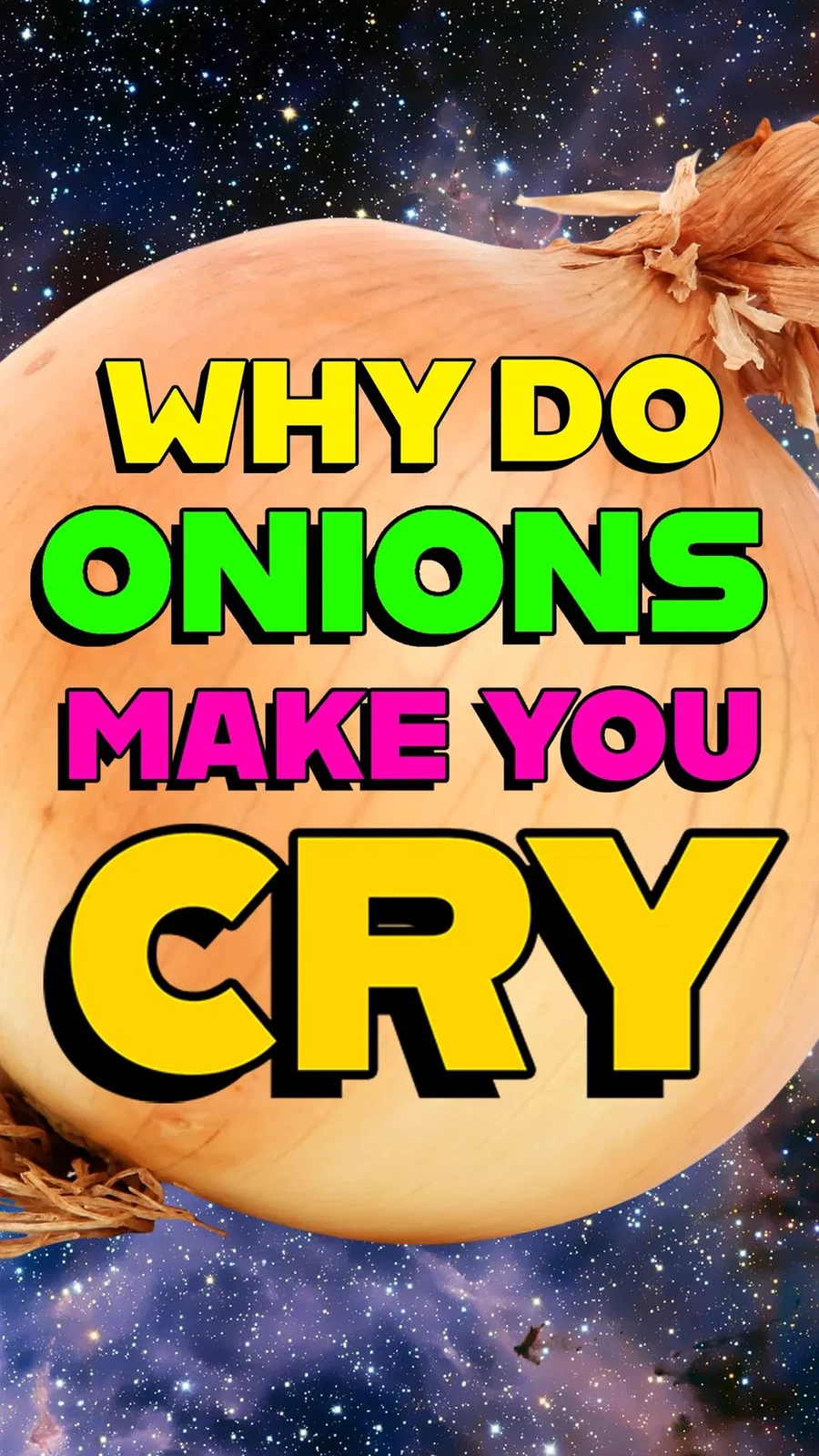
Onions

VIDEO →

High-energy, kid-friendly edutainment. Written and voiced by me.

  • Playground
  • Digital
I’m still there, 17 years old, sitting on the shores of Erhai Lake looking out across the water, watching dragons. Hundreds of miles long they curled around the Cangshan mountains in the distance. Leviathan snakes, swimming through the air, diving into the valleys and reappearing on the other side, dancing between the peaks. The most beautiful sight I have ever seen in my life. This is why the Chinese believe in dragons, because they actually exist here. Lavender introduced me to some of her friends over dinner in Shanghai, a professional face reader slash cosmetic consultant with very obvious and very well done plastic surgery, and her partner, a young specialist in the art of Feng Shui. His clients would take his auspicious guidance on how to best lay out their offices. I tackled him with a few light questions from what I thought I knew about Chinese philosophy, and particularly the symbolism of dragons. He told me, “Dragons are the great inexplicable forces of heaven manifest in the world. They are creatures of the sky, but they reside in the great rivers, where they birth great civilisations, and when they take flight empires fall. Shanghai has a dragon, London has a dragon, all the great cities of the world have dragons.” “And we can see them?” “Only Kings. Kings, it was believed in the times of them, were the embodiment of dragons on Earth. They communed with them. Indeed, only a King may see a dragon and live.” I journeyed into the secrets of the Tao: the delicate winding path between the Yin and the Yang, characterised as a dance between the Dragon and the Phoenix, or birth and death, or the Heavens and the Earth. Dragons never die. If they once ruled the Earth then they still do.
2026▶ preview

Chasing Dragons

READ MORE →

A short piece about the most delicious thing I have ever tasted: a bowl of noodles in a back alley in southwest China.

  • Playground
  • Writing
2022▶ preview

Spookopolis Returns

ARTWORK →

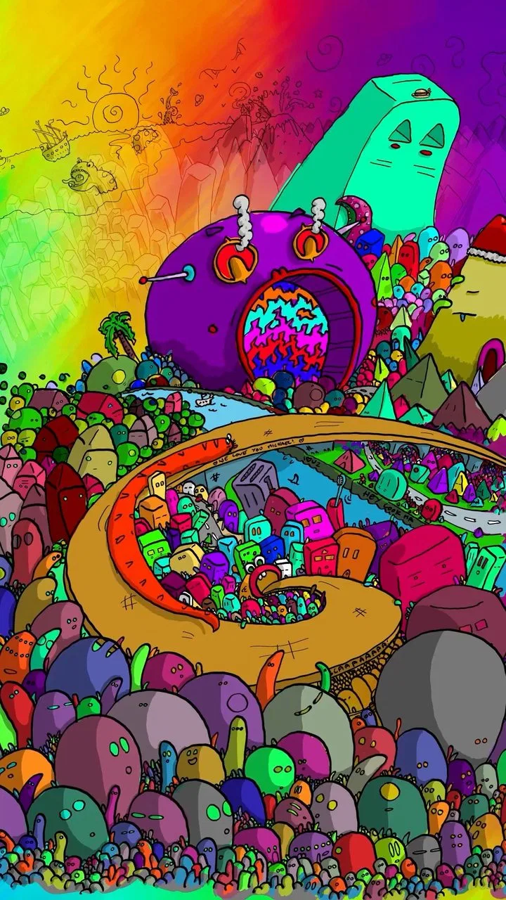
An impossible parallax that pulls you into the city.

  • Playground
I am not a robot
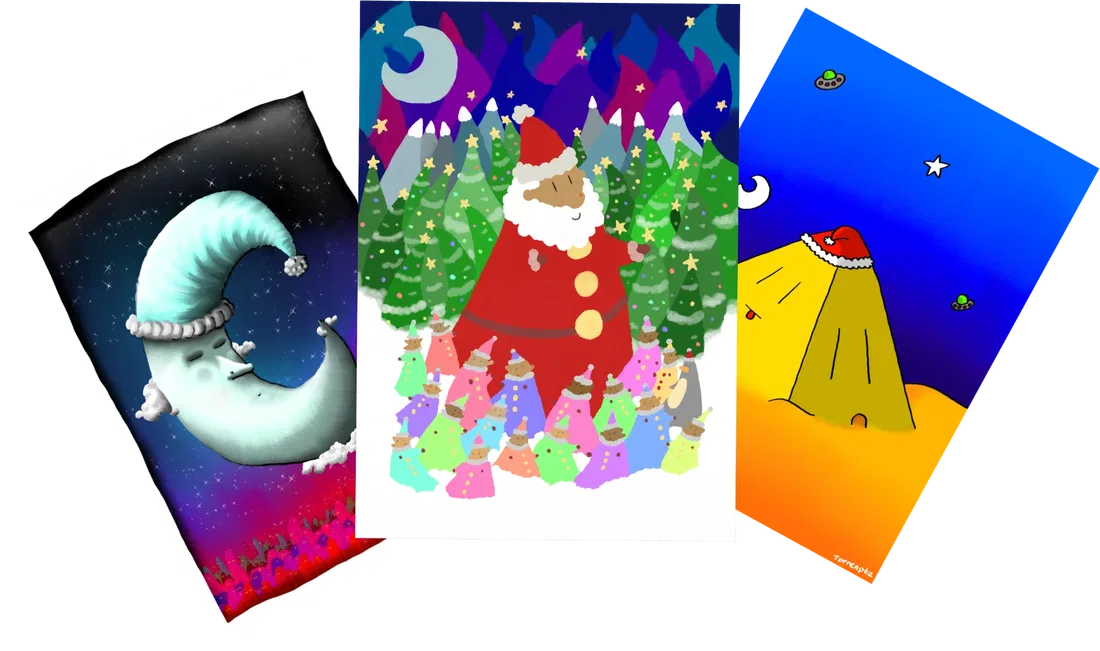
Christmas Cards
Ongoing▶ preview

Christmas Cards

GALLERY →

My Christmas card designs over the years.

  • Playground

Digital Painting & Animation · 2023

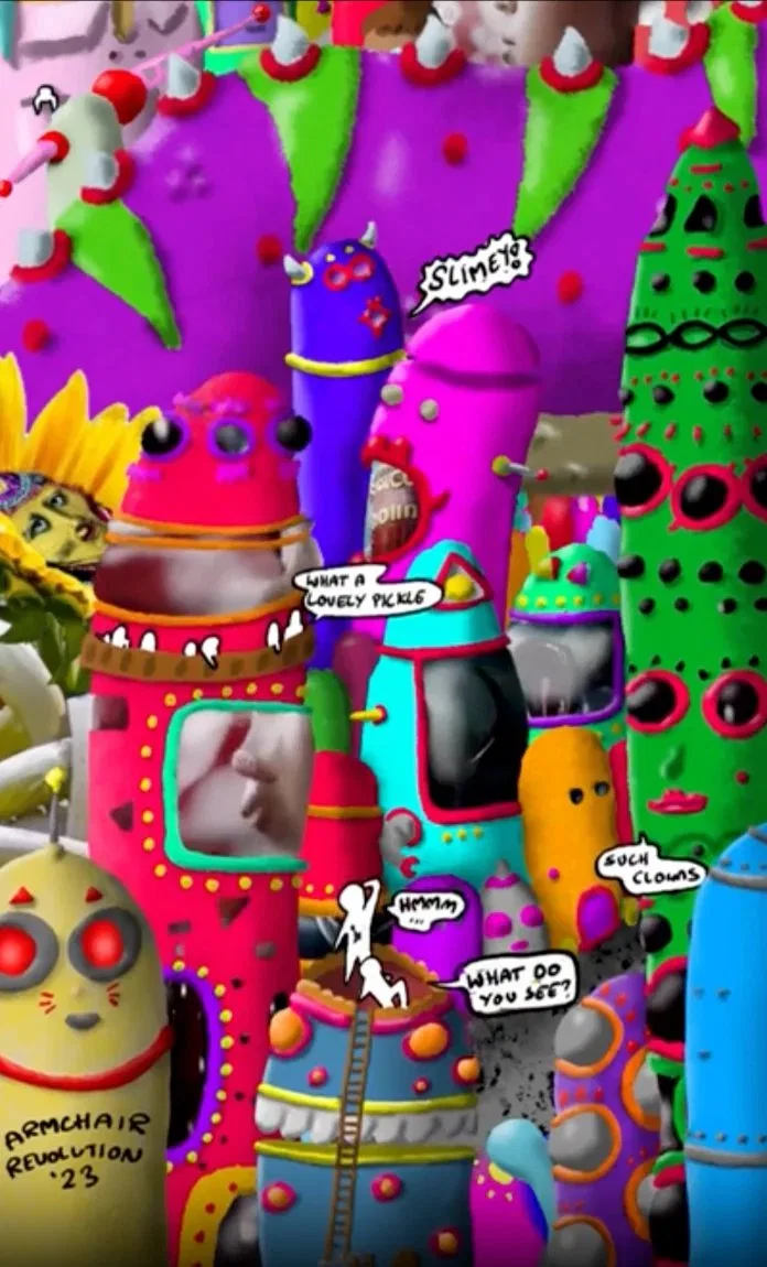
This piece experiments with taking the viewer on a journey up through the Golden City, ultimately meeting its Godking, a giant purple tentacle monster that has haunted my artwork since I was a child.

There is an awful lot going on here, too much even, maybe that’s part of the point… I’m not really sure. It can be hard to strike a balance between engaging and overwhelming, but something I re-learned with this one is that people prefer knowing where to look; future projects should pay more attention to pacing and guiding the viewer in video.

Embedded in the artwork are some AI-generated video clips I created for use as billboard displays on the buildings (can you spot them?), to the effect of creating a contrast between my art and the “in-world advertisements”.

This piece was inspired by – and designed to be watched to – the song Normalizo by Letta Mbulu.

“There was a time when this whole life was a village,
Happy days, loving eyes, kiss the sun and catch the sky,
Walk together, eat together, every man a brother,
That was then,
So very different from the Golden City”

Original digital art and animation using Adobe Suite (Fresco, Photoshop, Premiere Pro and After Effects, with small experimental AI-generated elements from Firefly and Runway ML).

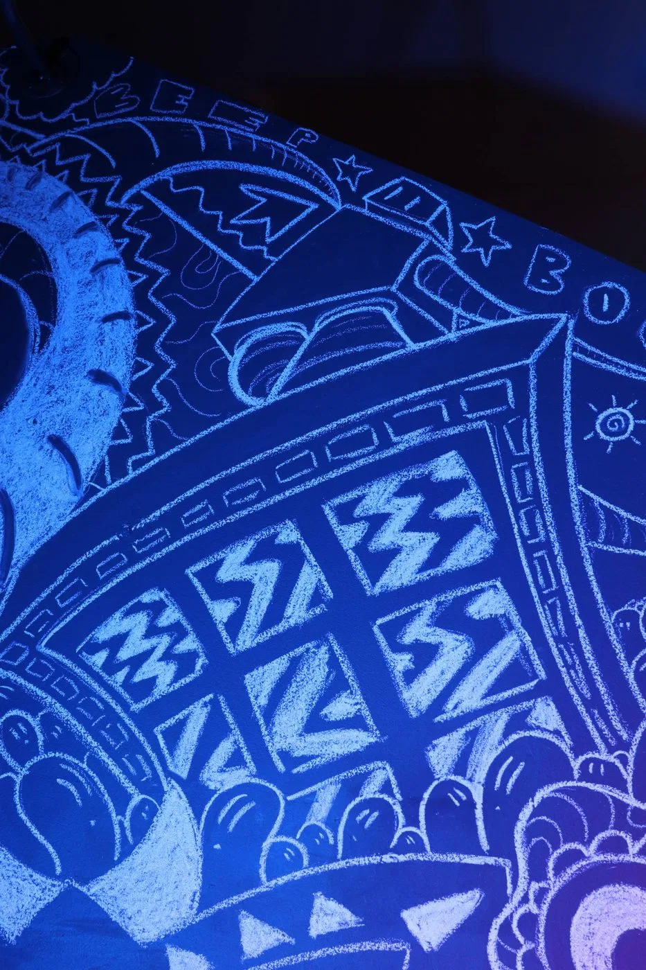
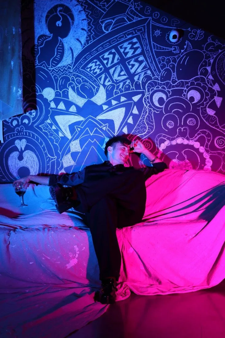
Chalk Mural · 2025

I had the insane pleasure of chalking up this wall at the Old Diorama Arts Centre as part of the From Soil To Stone exhibition, which ran until the end of 2025.

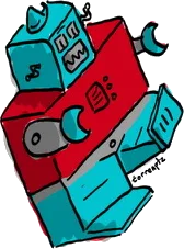
The three monster heads in the foreground act as headrests for the sofa in front, munching whoever sits there. In the midground a giant robot frolics through the city, crushing and taking what it pleases while the bean people gawk in horror and awe. The bottom of the robot’s shoe is a complex of television screens.

My mantra with this one was “hundreds of people might see this, make it entertaining”.

★ Beep ★ Boop ★

All photos by @chrissypeaches

▦ gallery

2024

Single-use £5 paper cards that Briki’s customers can give as a gift or pass on to someone in need for a coffee and something to eat. Any unspent balance goes to the housing charity Shelter.

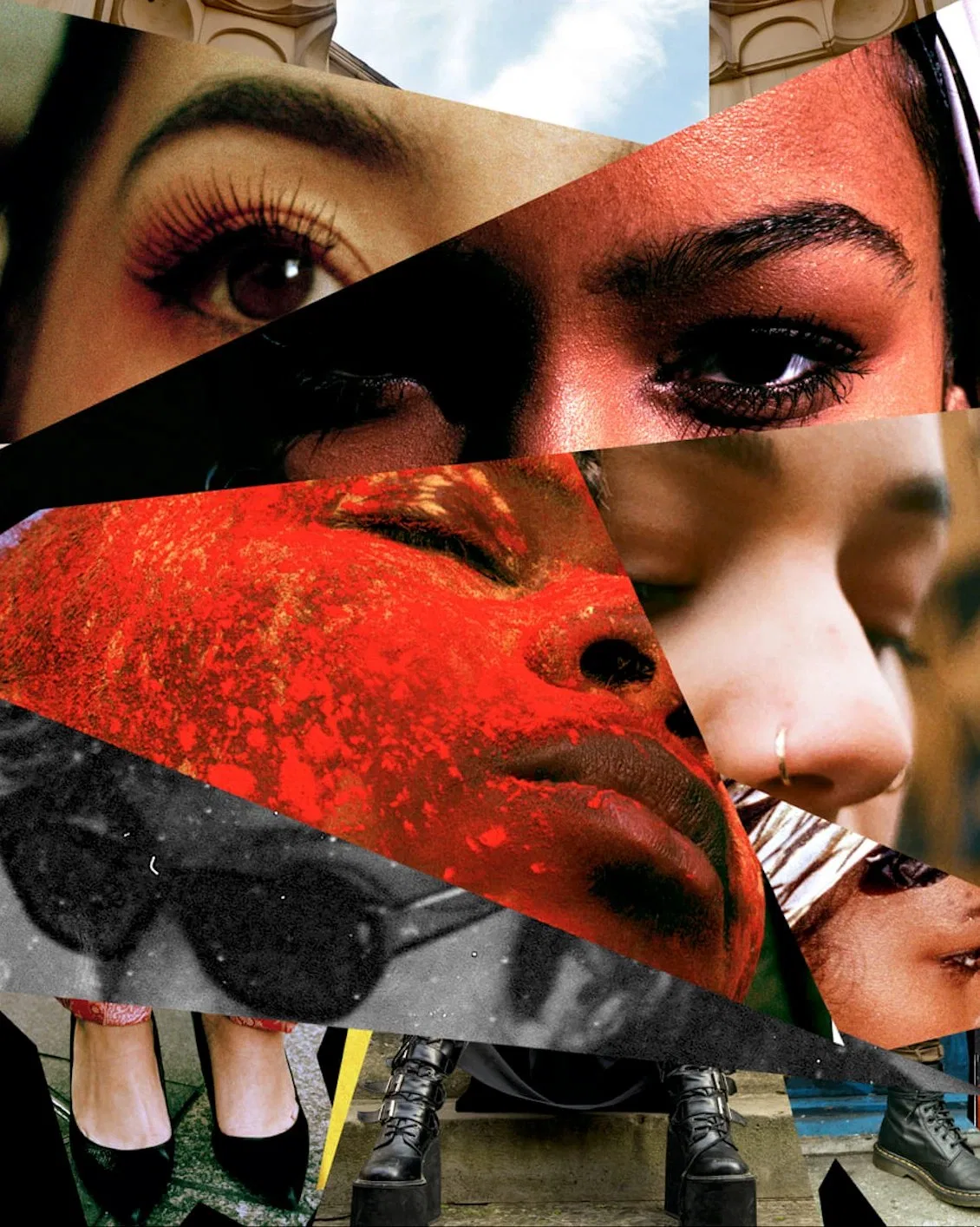
Promotional Bumps · 2019

HERES was a London photography, art and events collective exploring Londoners’ shared culture and heritage. I joined in 2019 to help shape the early brand and produce digital media.

Showcased here: a series of short promo “bumps” for Instagram and YouTube, built to grab attention, celebrate the team’s photography and build intrigue ahead of launch.

Made with Adobe Premiere Pro and After Effects.

▶ video

2025

An animated conversation between me and my best friend Meredith.

▶ video

2025

High-energy, kid-friendly edutainment. Written and voiced by me.

Digital Painting & Animation · 2022

I wanted to bring an experiment with movement and colour into my cityscape paintings.

The foreground and background move in opposite directions, which doesn’t make physical sense. This impossible parallax is designed to elicit a feeling of disorientation and being sucked into the piece. The whirlpool shape of the city is made explicit by the spiral runway into the fish mouth at the centre.

“When we gon’ rise up?
When we gon’ wise up,
We in the same boat,
We ride the same sail”

Original digital art and animation using Adobe Suite (Fresco, Photoshop, Premiere Pro and After Effects).

▶ video

2021

I Am Not A Robot is an art series by creative Amy Jackson, with whom I collaborated to produce supporting digital media: the video and the interactive web toy. The questions the piece asks come from a place of both hope and hopelessness in the rapidly shrinking space that still belongs to us humans.

▦ gallery

Ongoing

Pop your address in below to join the list, and I’ll post you one of this year’s cards.

☺ about⌂ home
Torren Pietzsch

About

I’m Torren Pietzsch, a London-based designer and creative producer. I’ve been making up brands for fun since I was a kid.

I rolled out a recruitment firm’s rebrand, from the website to the launch party, and I’ve designed and built websites for small businesses and creatives, including a specialty coffee shop’s site used by 7,000 people in its first year. I’ve also been putting on events since I was a teenager, from council youth programmes to art nights in Camden.

I like the whole journey: working out what a brand needs to say, building the identity that says it, then making it happen in the real world.

Outside work I paint, write, perform improv and make funny videos, which is where most of my ideas start.

Tools
Photoshop, Premiere Pro, Fresco, Webflow · After Effects, Illustrator · Claude Code, Claude Design
Currently
looking for a role with a creative agency.